Fast executive reporting
Turning a clean KPI table into a branded chart with a concise takeaway for a weekly update, memo, board deck, or investor report.
Independent tool overview
Graphy is an active browser-based chart maker for turning tables, spreadsheets, files, prompts, and API data into polished interactive visualizations. Its AI can recommend chart types, help reshape data, generate headline takeaways, and respond to editing requests, while the visual editor handles styling and annotations. It is strongest for presentation-ready data storytelling, but every transformation, calculation, label, source, and AI-written conclusion still needs review against the original data.
Visit the official Graphy site ↗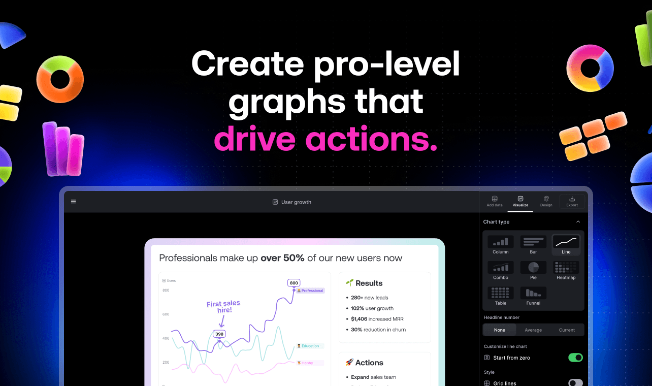
Overview
Graphy is a data-visualization and storytelling tool, not a full business-intelligence warehouse. Users can type or paste values, upload CSV or Excel data, connect a Google Sheet, call an API, or ask AI to search for data, then create and share an interactive chart.
The current product combines a conversational AI assistant with traditional chart controls. Graphy says it inspects a dataset, suggests three clear chart options with headline takeaways, shows a step-by-step account of its data transformation, and lets users request changes in plain English or edit directly.
The editor supports many common business and survey formats, including bar, line, pie, donut, scatter, waterfall, heatmap, funnel, table, Likert, time-series, combo, Mekko, and bubble charts. Charts can be branded, annotated, shared by link, embedded, presented, or exported for reports and slides.
Graphy also markets a separate React charting SDK and agent API for embedding editable data experiences in software products. Access and commercial terms for that developer product are separate from the self-serve visualization plans and require contacting the company.
AI can speed up chart selection and explanation, but it does not make a weak dataset trustworthy. Before publishing, compare Graphy's transformed table and chart against the source, recompute important metrics, inspect missing values and filters, and test whether the visualization is honest, legible, accessible, and appropriately sourced.
Use cases
The strongest fit depends on the job you need the product to complete, not the size of its feature list.
Turning a clean KPI table into a branded chart with a concise takeaway for a weekly update, memo, board deck, or investor report.
Producing polished, shareable charts for newsletters, social posts, research content, and customer-facing reports.
Improving the presentation of data from Excel or Google Sheets without building every chart from scratch.
Visualizing Likert, comparative, percentage, categorical, and time-based survey results with clearer annotations.
Collaborating on a limited set of story-driven charts when a full BI implementation would be excessive.
Using Graphy's separate SDK and agent API to add typed, editable charts inside a React application after a technical and commercial evaluation.
Capabilities
Accepts typed or pasted tables, CSV and Excel uploads, live Google Sheets, REST API data, and AI-assisted data search.
Inspects the dataset and proposes chart options intended to communicate the clearest patterns.
Lets users ask for a chart, insight, answer, or visual change in plain English.
The product describes a visible step-by-step record of how raw data was reshaped into the selected visualization.
Generates short narrative summaries to accompany charts; these are editorial suggestions that require verification.
Covers common comparison, trend, survey, distribution, composition, relationship, and process visualizations.
Users can refine the AI output with conventional editing panels instead of relying only on prompts.
Supports themes, colors, fonts, labels, trend lines, goal markers, and callouts; higher plans add custom colors and brand kits.
Charts can be shared with unlimited viewers, embedded in other tools, or presented interactively.
Supports high-quality output for slides, reports, documents, and social channels; exact export availability can depend on the current editor and plan.
The Business plan lists automatic refresh from connected Google Sheets.
The Business plan adds password-protected sharing for charts that should not be openly accessible.
Graphy's separate React library uses a typed configuration object and supports editable charts, while its agent SDK can generate or modify configurations from language instructions.
Process
Step 1
Write down the audience, question, time period, comparison, units, and action the chart should support before choosing a visual.
Step 2
Keep a version-controlled dataset with stable row and column definitions, source links, extraction time, timezone, filters, and metric owners.
Step 3
Resolve duplicate rows, inconsistent categories, mixed units, missing values, date formats, subtotal rows, suppressed values, and personally identifiable information.
Step 4
Paste only the necessary aggregate table for one-off work, or connect an approved Google Sheet or API when controlled refresh is worth the added access and privacy surface.
Step 5
Review every inferred type, aggregation, pivot, sort, filter, calculation, and renamed field before accepting the suggested chart.
Step 6
Use bars for discrete comparisons, lines for ordered time, scatterplots for relationships, and composition charts sparingly. Avoid axes, scales, and encodings that exaggerate differences.
Step 7
Independently check totals, percentages, changes, rates, averages, denominators, rounding, date windows, goals, and trend lines against the source.
Step 8
Treat AI-written headlines as drafts. Remove causal language unsupported by the data, qualify uncertainty, and name the exact segment and time period.
Step 9
Include units, definitions, source, as-of date, sample size, exclusions, methodology, and notes needed to interpret the chart correctly.
Step 10
Check color contrast, color-blind-safe palettes, readable type, direct labels, descriptive titles, keyboard and screen-reader needs, mobile behavior, and a data-table alternative.
Step 11
Decide whether the output can be public, needs a password, belongs in a controlled document, or must remain inside an approved workspace. Test embeds and links in a signed-out browser.
Step 12
Have the metric owner approve high-stakes charts. For live sources, periodically test refreshes, schema changes, stale data, broken links, and unexpected public exposure.
Cost
Graphy currently lists a free plan plus Plus and Business subscriptions priced per user per month. The pricing page also shows a 20% annual-billing discount indicator, but the static public text does not clearly expose both checkout totals, so confirm billing frequency, currency, taxes, renewal, and cancellation terms before purchase. The developer SDK and agent API use a separate sales process.
Free
For creating and sharing a small number of branded charts.
$16 per user/month
For individuals and teams creating ongoing internal or external reporting.
$36 per user/month
For teams that need automated spreadsheet refresh and more controlled branding and sharing.
Contact sales
For embedding Graphy's chart library and agent capabilities in a software product.
Pricing checked . Check current pricing at the source ↗
Assessment
Compare
The right alternative depends on the specific output, workflow, controls and budget your project requires.
Data Analysis
Choose Rows when spreadsheet analysis, formulas, integrations, and reporting logic matter more than specialized visual polish.
Explore Rows →Data Analysis
Choose Google Sheets with Gemini when the data already lives in Sheets and keeping analysis, formulas, tables, and charts together is the priority.
Explore Google Sheets AI →Data Analysis
Choose Julius AI for a more analysis-first conversation that includes code-backed exploration and chart generation.
Explore Julius AI →Design
Choose Canva AI when charts are one element inside a broader designed presentation, document, campaign, or social asset.
Explore Canva AI →Business Operations
Choose ChatGPT for flexible data analysis and chart coding when you want more control over calculations and can manage presentation styling yourself.
Explore ChatGPT →Questions
Graphy is an online AI-assisted chart maker for importing data, finding insights, creating interactive visualizations, styling them, and sharing or exporting the result.
Yes. Its chart editor, public site, pricing plans, templates, developer product, and sign-up flow are currently active.
Graphy has a free plan for up to five charts with limited AI use and Graphy branding. Paid plans add unlimited charts and AI features, with additional business controls at the higher tier.
The current public page lists Plus at $16 per user per month and Business at $36 per user per month. It also advertises a 20% annual-billing discount, so verify the exact checkout total and currency.
The site lists manual entry, pasted tables, CSV, Excel, live Google Sheets, REST API data, and AI-assisted web data search.
The Business plan lists automatic Google Sheets refresh. API-backed and embedded developer uses are also promoted, but teams should test refresh timing, errors, and schema changes.
Its current catalog includes common bar, line, pie, donut, scatter, waterfall, funnel, heatmap, table, time-series, Likert, combo, Mekko, bubble, survey, and comparative charts.
Yes. It can suggest chart types, reshape data, answer questions, and draft takeaways. Important calculations and interpretations must still be checked against the original source.
Yes. Graphy markets interactive links and embeds for documents, sites, and other tools. Test access in a signed-out browser before sharing confidential data.
Logo removal is listed on the Plus and Business plans, not the free plan.
Password-protected links are currently listed as a Business-plan feature.
Usually not. Graphy is optimized for fast, story-driven charts and reporting. Complex governed models, row-level security, enterprise administration, and deep dashboard ecosystems may require a full BI platform.
Graphy markets a separate React chart SDK and agent API with typed configuration and editable charts. Access and pricing require a separate evaluation.
Treat it as a draft. Verify the numbers, transformations, time period, sample, uncertainty, source, and wording, and remove causal or comparative claims the data does not support.
Bottom line
Graphy is a strong fit when the bottleneck is turning an already trustworthy table into a clear, attractive story. Its mix of AI recommendations, visible transformations, hands-on editing, rich chart types, and flexible sharing is more useful than a generic one-click graph generator. The main danger is aesthetic confidence outrunning analytical confidence. Keep the source table and metric owner in control, independently verify every transformation and takeaway, and use protected sharing and a formal vendor review for confidential reporting.
Visit Graphy website ↗
Get access to all our AI courses, hundreds of real-world AI use cases, live expert-led workshops, an exclusive network of AI early adopters, and more.
Get unlimited access to all of our current & upcoming industry-specific AI courses for the duration of your subscription.
To keep up with the rapid pace of AI, our team publishes AI implementation guides daily. Our library contains 300+ practical use cases to automate real-world work.
Join weekly, live, interactive sessions with industry leaders who are at the forefront of AI for hands-on implementation guidance and exclusive insights.
Network with an exclusive community of AI-first professionals who are working smarter with AI. Learn how early adopters are using AI in their work and businesses.